A UX case study for a pre-service payment flow redesign I created for Clear Health, which simplified billing, increased upfront payments, and helped secure early funding.
Clear Health™️ offers medical billing software that help hospitals, surgery centers, and clinics consolidate multi-provider fees into one Good Faith Estimate to patients instantly via text and SMS.
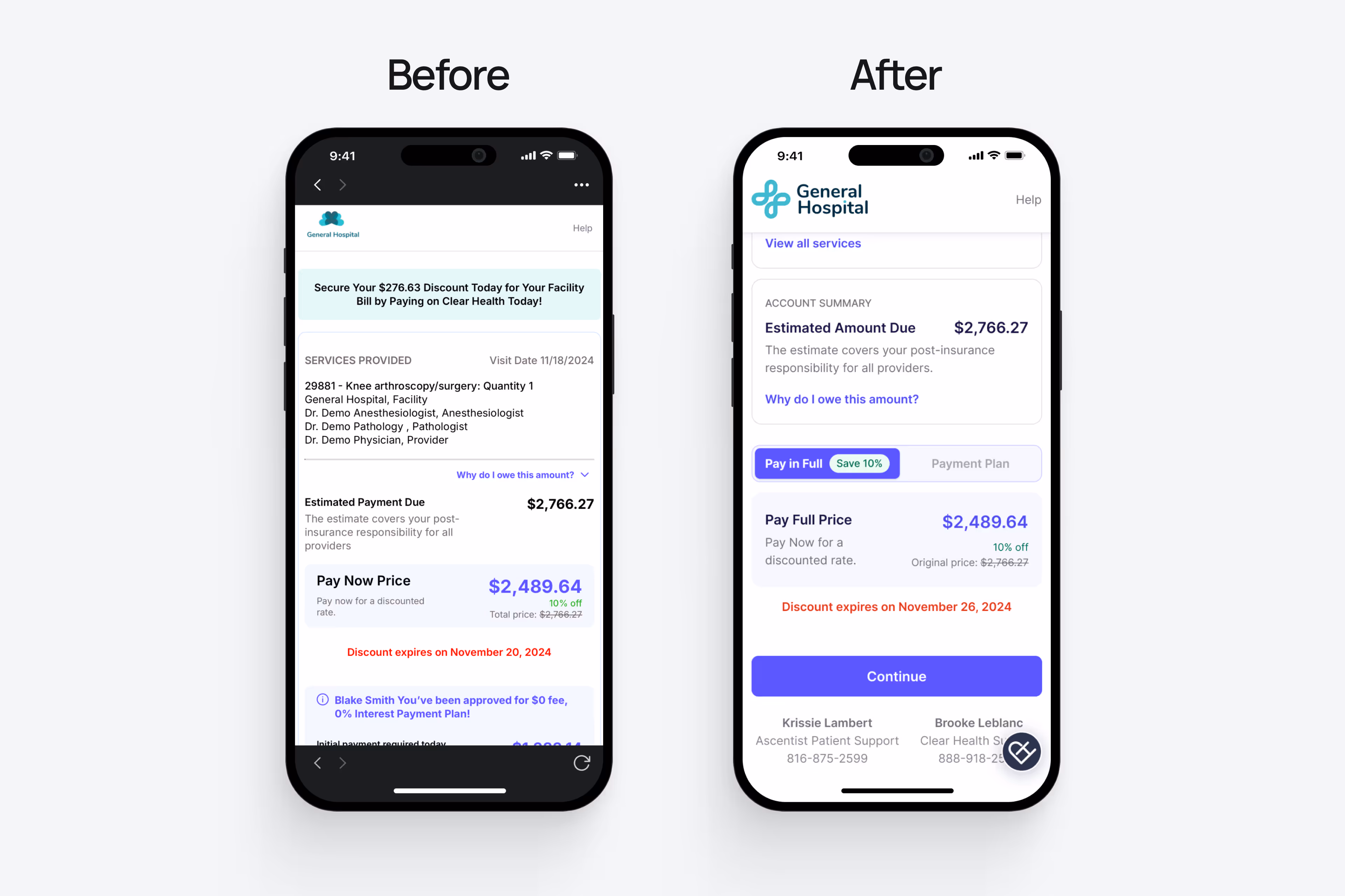
Patients saw multiple prices at once and couldn’t tell what they owed or what insurance covered.
Simplify the billing flow.
Clarify total cost of care.
Increase upfront payments.
Displaying multiple provider breakdowns risked overwhelming patients, and dozens of cost details had to fit within mobile screens.
Improved information hierarchy using spacing, color, and typography to reduce visual strain and increase completion rates.
Consolidated all fees into a single cost breakdown.
Added a scrollable dropdown for itemized costs.
Introduced a toggle to compare payment options.
Implemented progress steps to guide users and reduce cognitive load.
Added a “Save 10%” badge to encourage upfront payments.
Removed notifications that distracted users from completing payment.
✅ Secured early funding
✅ 96% upfront collections
✅ 10k+ user growth
✅ 46% revenue growth
Small UX changes = big outcomes.


