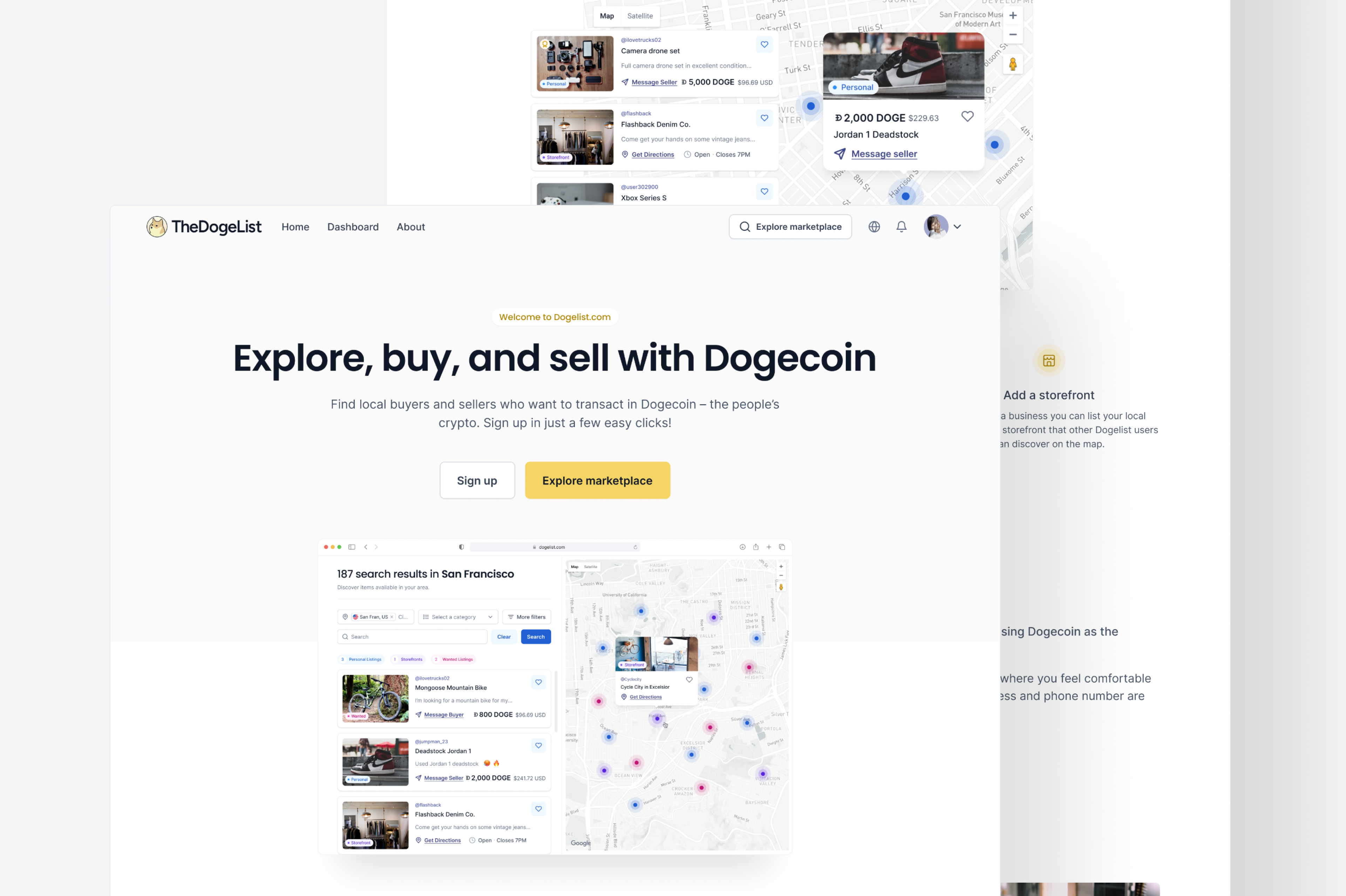
Designed the web app from 0→1, an interactive marketplace platform for buyers, sellers, and businesses that accept Dogecoin or USD.
The DogeList is an interactive marketplace where buyers, sellers, and businesses discover each other through an interactive map while buying and selling with Dogecoin or USD.
Over a two-year partnership from 2022 to 2024, we worked alongside the founders to take the product from concept to launch. We designed the marketplace experience, onboarding flow, interactive map, dashboard, and marketing website.
Marketplace products only succeed when users experience value quickly enough to stay engaged.For The DogeList, the challenge wasn’t designing an interactive map. It was helping users understand why they should care about it before asking them to create an account.
Every additional click between curiosity and the map delayed the product’s first meaningful interaction.
Instead of asking, “How do we explain the product better?” we asked, “How do we help users experience the product sooner?”
Our initial concept followed a familiar SaaS pattern.The homepage explained the marketplace before directing visitors toward a call to action beneath the hero section that linked to the map.On paper, it made sense.
In practice, something felt off.We realized we were asking visitors to trust the product before they had experienced it.For a marketplace built around discovery, that introduced unnecessary friction.The homepage wasn’t the destination.The map was.
200+ active users
22% conversion from X followers to sign-ups (industry average: 2-5%)
75% of sign-ups create listings in their first session
50% of users actively listing products
We didn’t have the budget or timeline for extensive user research.Instead of relying on assumptions, we studied products that had already solved similar discovery challenges.One product kept surfacing during our research: Airbnb.
Our goal wasn’t to create a Airbnb replica, but because Airbnb had already solved a similar behavioral problem.It gets users interacting with the product almost immediately, allowing them to experience value before asking for commitment.That mental model aligned perfectly with the experience we wanted to create.
Our first exploration borrowed Airbnb’s filtered search experience and placed it directly on the homepage. Technically, it solved the activation problem. Users could begin exploring immediately. But another problem appeared. The homepage no longer felt like The DogeList. The interaction accelerated discovery but weakened the product’s identity. Instead of copying the interface, we kept the principle: Reduce the distance between curiosity and value.
We removed the homepage search experience and replaced it with a prominent “Explore Marketplace” call to action above the fold.
The homepage established trust. The map delivered the experience. By separating those responsibilities, we preserved the brand while still shortening the path to value.
After launch, another usability challenge emerged. Once users created an account, the homepage was no longer their primary entry point. Returning users needed a faster way to jump back into the marketplace from anywhere inside the product.
Rather than forcing users back through the homepage, we introduced filtered search into the primary navigation.
The interaction matched a mental model users already understood from products like Airbnb while making exploration accessible from every screen. The homepage optimized activation. The navigation optimized retention.
Reducing the distance between curiosity and value had a measurable impact on activation.
75% of new users created a listing during their first session.
50% of users actively listed products.
22% conversion from X followers to sign-ups, compared with an industry average of 2–5%.
200+ active marketplace users.
5,400 X followers.
Marketplace products don’t succeed because users understand them. They succeed because users experience their value. Every design decision should reduce the distance between curiosity and that first meaningful interaction. The UI wasn’t what increased activation. The product strategy behind it did.





